
Valg af skrifttyper til lasergravering og vinylskæring
Du fandt den perfekte skrifttype. Den så fantastisk ud på skærmen med alle sine fine slyngninger og hårfine streger. Så skar du den, og nu ligger midten af hvert "e" i affaldsbakken, to bogstaver knækkede på de tynde dele, og vinylversionen tog fyrre minutter at luge, før du gav op.
Skrifttypen var aldrig problemet. Skrifttypen var forkert til processen. Den forskel er hele pointen, og når du først ser den, bliver valg af skrifttype ikke længere et spørgsmål om smag, men et teknisk spørgsmål med smag oveni.
Tip
Kort svar: Næsten enhver skrifttype egner sig til gravering, fordi gravering bare tegner på overfladen. Skæring er filteret. Til skåret tekst skal du undgå hårfine streger, holde øje med de lukkede tællerum (hullerne i bogstaver som "o" og "a") og vælge stencilskrifttyper eller sammenhængende skriftskrifttyper, når designet kræver det.
Gravering tilgiver. Skæring gør ikke.
Et graveret bogstav er et mærke på en overflade. Materialet nedenunder forbliver samlet, så bogstavet kan være så fint, som din maskine kan opløse. Tynde seriffer, lette ender på skriftskrift, bittesmå bogstaver: Laseren brænder det hele uden problemer, og intet falder af, fordi intet nogensinde var separat.
Et skåret bogstav er et fysisk objekt. I det øjeblik klingen eller strålen går hele vejen igennem, skal alle dele af bogstavet kunne klare sig selv. Tynde streger bliver skrøbelige små broer af træ eller akryl. Og enhver helt lukket form inde i et bogstav falder ganske enkelt ud: Skær omridset af et "O" gennem krydsfiner, så er midten væk, fordi intet længere holder den fast.
| Gravering | Skæring | |
|---|---|---|
| Bogstavet er | Et mærke på overfladen | Et fysisk stykke |
| Tynde streger | Fine, de er bare linjer | Knækker, rives over eller brændes væk |
| Lukkede tællerum ("O", "A", "e") | Intet problem | Falder ud (eller bliver til lugearbejde i vinyl) |
| Fine skriftskrifttyper | Smukke | Skrøbelige og besværlige |
| Valg af skrifttype | Næsten alt fungerer | Struktur er lige så vigtig som udseendet |
Derfor kan den samme skrifttype være perfekt til ét projekt og en katastrofe til det næste. En hårfin skriftskrift graveret på et skærebræt: fantastisk. Den samme skriftskrift skåret ud af 3mm krydsfiner som selvstændige bogstaver: en pose knækkede makaroni.
PRINT. SKÆR. FRÆS.
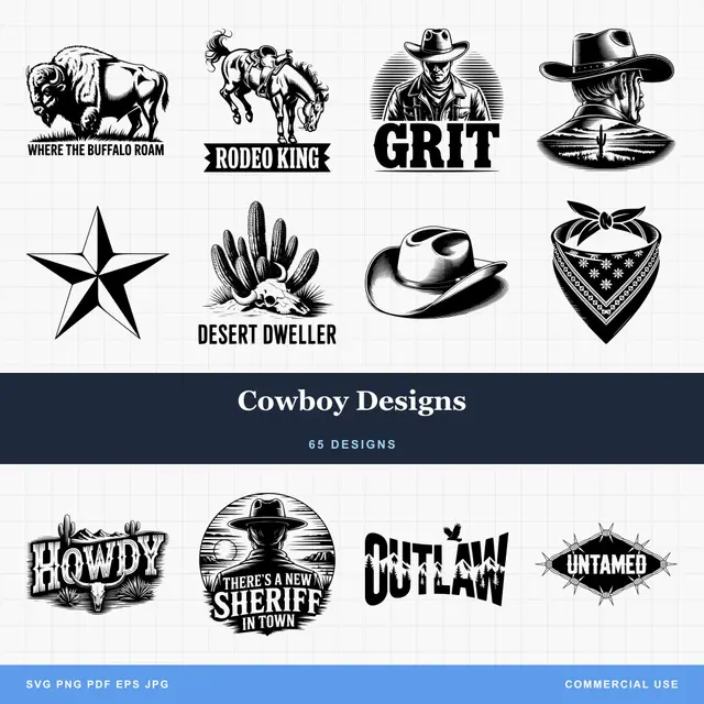
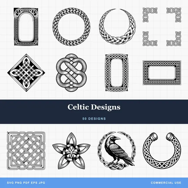
- Flere formater (SVG, DXF, PNG)
- Maskintestede designs
- Kommercielle licenser
Sponsoreret af PrintCutCarve.com
Hvad går faktisk galt, når du skærer tekst?
Tre fejl står bag næsten alle skuffelser med skåret tekst, og hver af dem har en kendt løsning.
1. Tynde streger knækker
Når en streg bliver meget smallere end materialet er tykt, skærer du en lang, tynd bjælke, der gerne vil knække. Et forsigtigt udgangspunkt for træ og akryl: Sørg for, at den smalleste del af et bogstav er mindst lige så bred som materialets tykkelse, og test derefter på et stykke af det faktiske materiale. Hvis skrifttypen ikke kan levere det i din størrelse, så vælg en kraftigere eller større skrifttype.
I vinyl knækker tynde streger ikke, de rives over. En hårfin streg løftes sammen med det omgivende affald, når du luger, og du ender med at udføre kirurgi med en lugekrog for at redde halvdelen af et ampersand.
2. Tællerum falder ud
De lukkede huller i bogstaver kaldes tællerum, og de er den klassiske overraskelse ved det første projekt. Skær "MOM" hele vejen gennem en plade, så falder begge "O"-midter ned på gulvet.
Du har tre ærlige muligheder:
- Brug en stencilskrifttype. Stencilskrifttyper findes netop til dette. De tilføjer små broer, som forbinder hvert tællerum med resten af bogstavet, så intet nogensinde er helt lukket. Det militærkasseagtige udtryk er ikke et tilfældigt stilvalg, men struktur.
- Behold et baggrundslag. Hvis bogstaverne bliver siddende på en bagplade (graveret, ridset eller skåret som et hævet lag, der limes på en base), har tællerummene noget at holde fast i.
- Placér tællerummene i hånden. Med vinyl luger du tællerummet og overfører det som sit eget lille stykke. Det kan lade sig gøre, og det er også grunden til, at erfarne vinylkreatører får stærke meninger om skrifttyper.
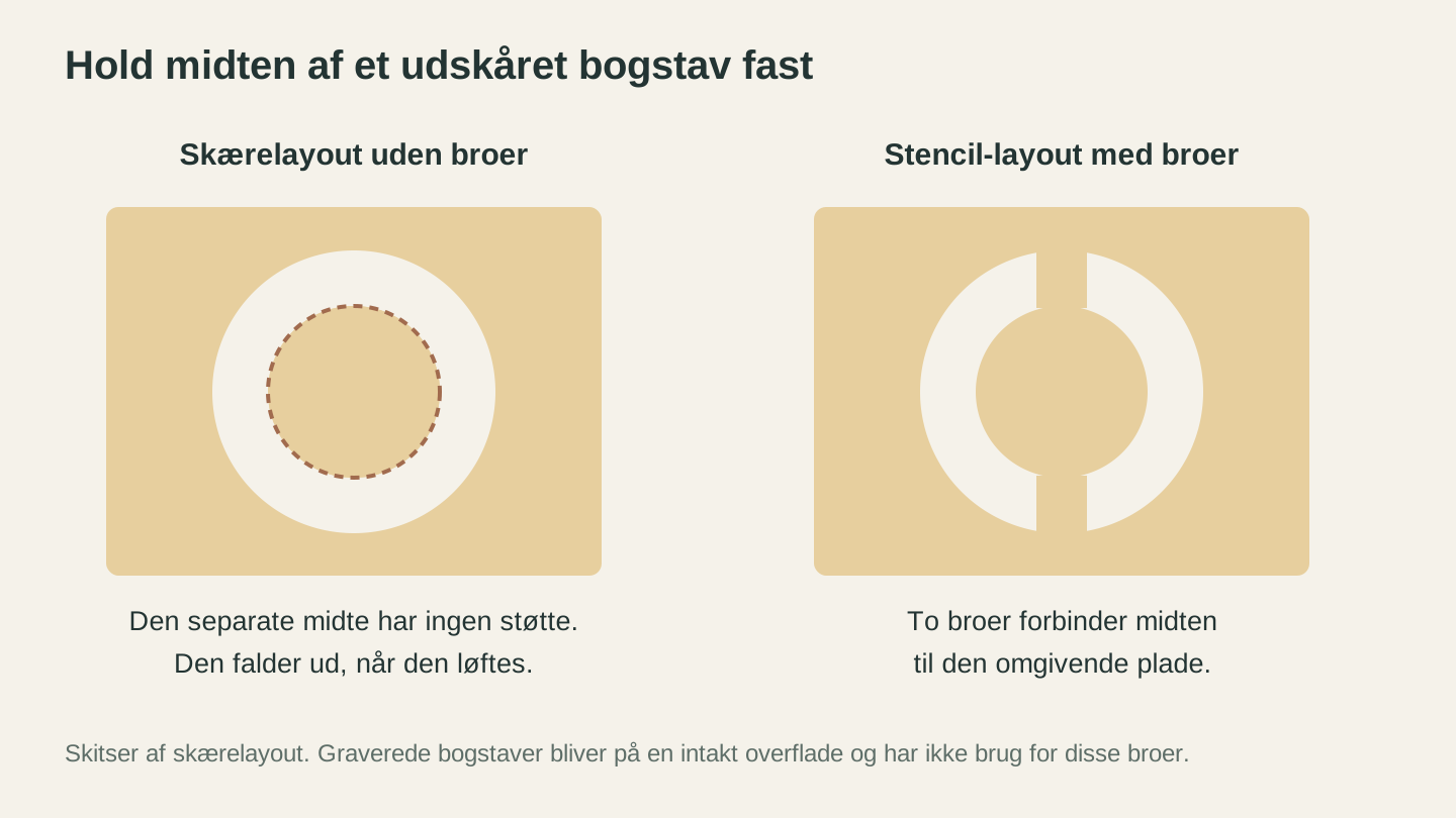
Et udskåret bogstavs omsluttede center skal have forbindelse til den omgivende plade. Dette problem gælder ikke mørke bogstaver, der graveres i en massiv overflade.
3. Usammenhængende skriftskrifttyper er frygtelige at luge
Her er en vinylspecifik fælde: en skriftskrifttype, hvor bogstaverne ser sammenhængende ud, men faktisk overlapper som separate former. Skær den, så følger maskinen hvert bogstav individuelt og efterlader snesevis af små flager mellem dem.
Ægte sammenhængende skriftskrifttyper, hvor bogstavformerne smelter sammen til én ubrudt form, skæres som ét stykke. Én kontur, én lugeproces, én overførsel. Hvis du laver navnedekorationer eller personlige navneskilte, er en korrekt sammenhængende skriftskrift sin vægt værd i transfertape. Når bogstaverne står separat, kan du svejse dem sammen i dit designprogram før skæring og opnå samme resultat.
Advarsel
Se de faktiske skærelinjer igennem, før du bruger materiale. En skrifttype, der vises som sammenhængende tekst på skærmen, kan stadig skæres som separate overlappende bogstaver. Hvis din software viser individuelle konturer omkring hvert bogstav, skal du svejse eller samle dem først.
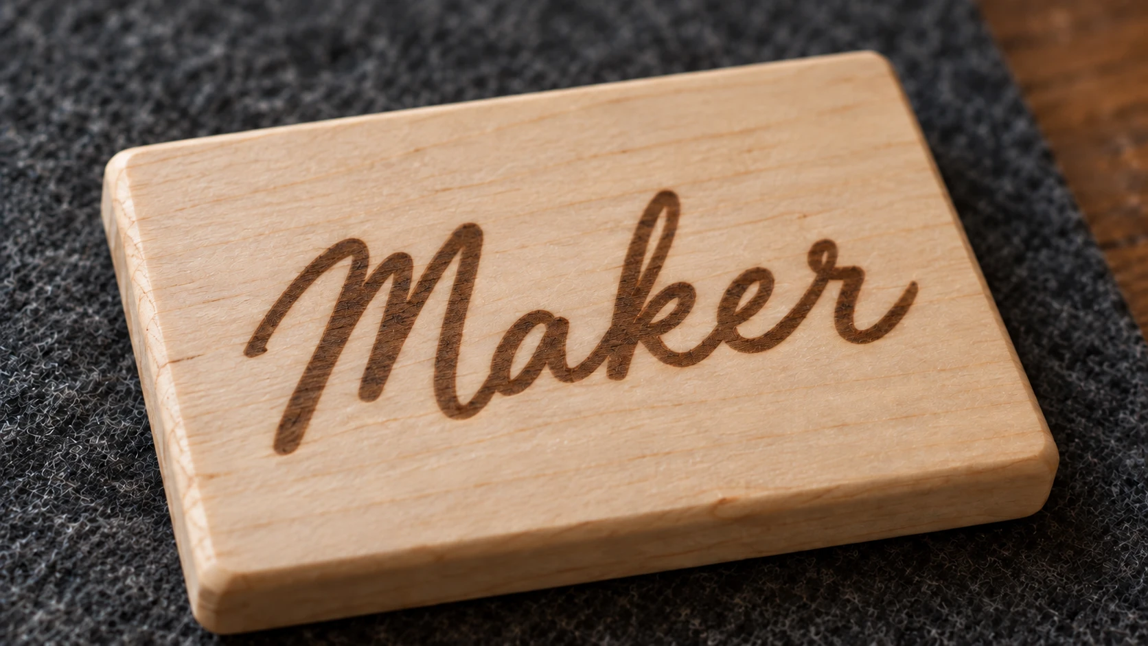
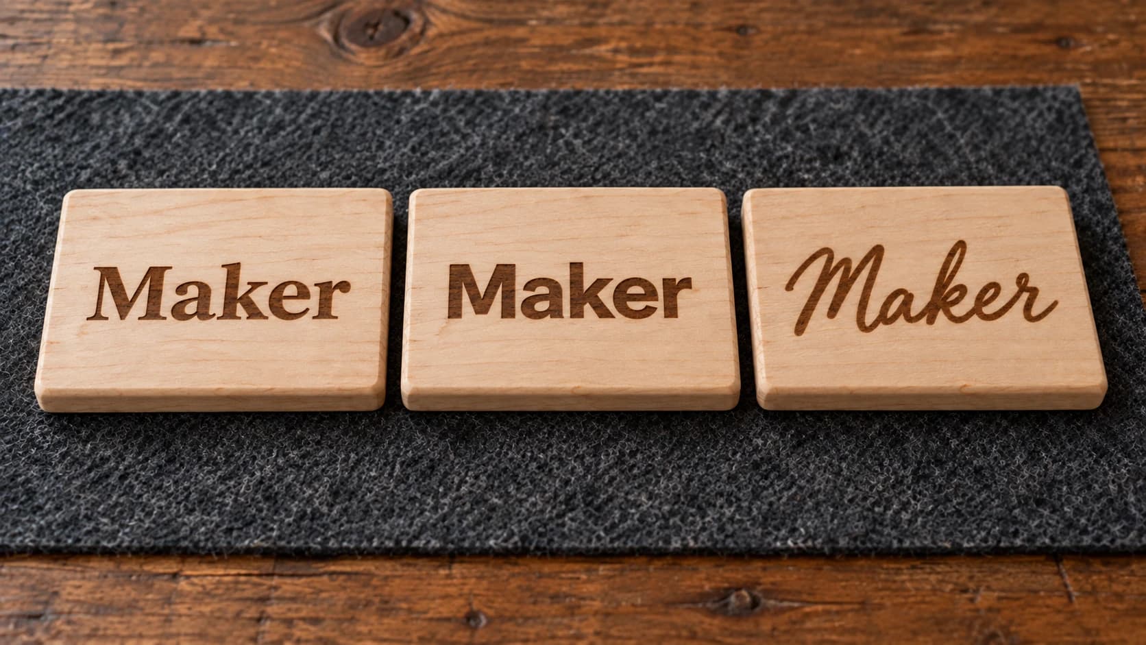
Disse fine scriptstreger er graveret i en sammenhængende overflade. Et script, der egner sig godt til gravering, kan stadig have brug for stærkere forbindelser, når det bruges som en separat udskåret form.
Hvor småt kan du gå?
Minimumsstørrelser afhænger af din maskine, dit materiale og din tålmodighed, så betragt dem som udgangspunkter snarere end fysik:
- Graveret tekst kan blive bemærkelsesværdigt lille. Mange laseropsætninger kan lave ren tekst ned til nogle få millimeter i højden med en enkel sans-serif. Fine serifdefinitioner fyldes først ud, så jo mindre du går, desto enklere bør skrifttypen være.
- Vinyl, der skal luges, bliver besværligt under omtrent en kvart tomme (6mm) bogstavhøjde, og skrifttyper med tynde streger rammer den grænse langt tidligere end kraftige skrifttyper. Hvis dine øjne gør ondt af at se på lugearbejdet, kommer dine fingre til at gøre ondt af at udføre det.
- Gennemskårne bogstaver i træ eller akryl følger reglen for stregbredde ovenfor: Grænsen er ikke bogstavets højde, men den smalleste streg. Et kraftigt bogstav på 20mm kan være mere robust end et fint bogstav på 40mm.
Og helt adskilt fra alt det: læsbarhed på afstand. Et skilt, der skal læses fra den anden side af et rum, kræver større og kraftigere tekst end de samme ord på en nøglering. Når du er i tvivl, så print designet i fuld størrelse på papir og sæt det op, hvor det færdige stykke skal hænge.
De fire skrifttypefamilier og hvor de passer
Alle skrifttypekataloger kan opdeles i fire brede grupper, og hver af dem har et naturligt hjem i maskinarbejde:
| Familie | Personlighed | Graveres | Skæres | Bedste anvendelser i maskinarbejde |
|---|---|---|---|---|
| Serif | Formel og traditionel | Smukt i mellemstore størrelser og opefter | Dårligt (tynde seriffer knækker og luges dårligt) | Graverede plaques, priser, formelle skilte |
| Sans-serif | Ren og neutral | Godt i alle størrelser | Bedst af de fire (jævne stregbredder) | Lille graveret tekst, skåret akryl, robust vinyl |
| Skriftskrift | Personlig og varm | Smukt | Kun hvis den er ægte sammenhængende | Navne, monogrammer, bryllups- og gavearbejde |
| Display | Markant og tematisk | Afhænger af skrifttypen | Afhænger i høj grad af skrifttypen | Et eller to ord, aldrig brødtekst |
Et par praktiske bemærkninger til tabellen. Sans-serif er arbejdshesten: Når et projekt skal skæres og skal kunne holde, er en sans-serif med mellemtykke streger næsten altid det sikre svar. Skriftskrift sælger personliggørelse; den er standard til navne og monogramprojekter, fordi den virker håndlavet og hjertevarm. Display-skrifttyper er krydderi, ikke måltidet: en uhyggelig skrifttype til overskriften på Halloween-skiltet og noget læseligt til alt andet.
Højst to skrifttyper
Den hurtigste måde at få et design til at se amatøragtigt ud på er at bruge fire skrifttyper, fordi du kunne lide dem alle. De klassiske regler for kombinationer holder også i maskinarbejde:
- Højst to skrifttyper pr. design. Én til stjernen (navnet, overskriften), én som støtte (datoer, slogans, de små detaljer).
- Kombinér kontraster, ikke kusiner. En skriftskrift oven på en enkel sans-serif fungerer, fordi de tydeligvis er forskellige. To lignende sans-serif-skrifttyper ligner en fejl i stedet for et valg.
- Giv dem forskellige opgaver og størrelser. Skriftskriften får navnet i fuld størrelse, mens sans-skriften får "Est. 2026" nedenunder i mindre størrelse. Ingen kæmper om opmærksomheden.
Hvis du vil afprøve kombinationer uden at brænde materiale, er Canvas Pro et gratis browserbaseret redigeringsprogram, hvor du kan placere tekst, stille muligheder side om side og eksportere en PNG-mockup, før du beslutter dig for en skæring.
Skrifttypelicenser, når du sælger det, du laver
Det, ingen har lyst til at tænke på, før det bliver vigtigt. En skrifttype er software, og licensen, der fulgte med den, fortæller, hvad du må gøre med den.
For kreative producenter er det vilkårene, ikke prisen, der betyder noget. En licens til personlig brug dækker dine egne projekter og stopper der. En desktoplicens lader dig installere skrifttypen og designe med den, men om disse designs må komme på produkter, du sælger, afhænger af den pågældende skrifttypes EULA: Nogle desktoplicenser tillader kommercielle varer direkte, mens andre kræver en separat kommerciel licens fra skrifttypeværkstedet. "Jeg har købt den" og "jeg må sælge produkter, der er lavet med den" er ikke automatisk det samme.
Den gode nyhed er, at generøse licenser er nemme at finde. Google Fonts tilbyder et stort bibliotek med gratis skrifttyper under åbne licenser, der generelt tillader kommerciel brug af det, du laver, og derfor standardiserer så mange små kreative værksteder på dem. Mange uafhængige skrifttypeværksteder sælger også overkommelige kommercielle licenser med helt tydelige vilkår.
Intet af dette er juridisk rådgivning, så den faktiske regel er kort: Læs licensen, før en skrifttype kommer på et produkt, du sælger. Det er som regel én side, og det er bedre end en akavet e-mail fra et skrifttypeværksted senere. Den samme vane gælder illustrationer: Vores guide til gratis SVG-filer til laser- og Cricut-projekter gennemgår licensdelen ved downloadbare designs, som volder folk problemer på samme måde.
Info
Opbevar en lille mappe med skrifttyper, som du har kontrolleret til kommerciel brug. Det er hurtigere at vælge mellem ti forhåndsgodkendte skrifttyper end at genlæse licenser midt om natten før et marked, og dine designs bliver samtidig mere ensartede.
Ofte stillede spørgsmål
Hvad er den bedste skrifttype til lasergravering?
Der findes ikke én, og det er netop pointen: Gravering håndterer næsten enhver skrifttype. Tilpas skrifttypen til projektets stemning, og forenkle kun (gør den enklere og kraftigere), når teksten bliver meget lille, og fine detaljer begynder at flyde sammen.
Hvorfor falder midterne af mine bogstaver ud, når jeg skærer?
Det er tællerum, de lukkede huller i bogstaver som "O" og "e". Når du skærer hele vejen igennem, holder intet dem længere fast. Brug en stencilskrifttype (dens broer holder tællerummene fast), behold bogstaverne på et baggrundslag, eller placér de udfaldne stykker i hånden.
Hvilke skrifttyper er nemmest at luge i vinyl?
Kraftige skrifttyper med jævne streger og få små lukkede områder samt ægte sammenhængende skriftskrifttyper, der skæres som ét ubrudt stykke. Hårfine streger og usammenhængende "falske" skriftskrifttyper er mareridtet ved lugearbejde.
Sæt de rigtige bogstaver på det næste projekt
Valg af skrifttype er en af de færdigheder, der ikke koster noget, men ændrer alt: samme maskine, samme materiale, markant bedre resultater.
Hvis projektet er et monogram eller et navnestykke, er Monogram Generator gratis og laver de klassiske layout for dig: delte monogrammer, indrammede initialer og flere skrifttypekategorier, eksporteret som ren SVG, der er klar til gravering eller skæring. Til skræddersyede bogstavdesigns, som ligger ud over det, en skrifttype kan klare, kan du beskrive designet for Vector Studio (1 credit) og få en maskinklar SVG tilbage. Og til først at lave mockups af layout og skrifttypekombinationer er Canvas Pro gratis i browseren.
Vælg to skrifttyper, kontrollér licensen, og hold øje med tællerummene. Så bliver affaldsbakken meget mindre fuld.
Relaterede værktøjer
Monogram Generator
Lav delte eller klassiske monogrammer med forskellige skrifttyper og rammer.
Vector Studio
Generér SVG-grafik ud fra en skriftlig beskrivelse og en valgt stil.
Canvas Pro
Redigér billeder med lag, pensler, former, tekst og markeringsværktøjer. Eksportér PNG, JPEG eller WebP.
Klar til at prøve disse værktøjer?
Tilmeld dig gratis, intet kreditkort kræves. Gratis værktøjer er tilgængelige med det samme.
Kom gratis i gang