
How to Make Custom Name Signs on a Laser
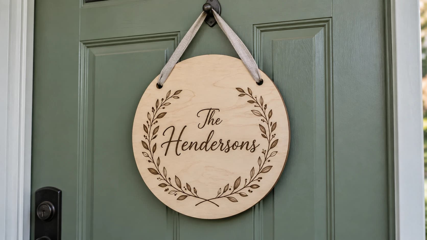
The first thing anyone asks a new laser owner for is a name sign. A sister-in-law wants "The Hendersons" for the front door before you've even leveled the machine. And the frustrating part is that the laser is not the hard bit. Burning a design into wood takes minutes. Getting to a design worth burning is where people stall.
Because a name sign is deceptively exposed. It's usually one word, big, in the most visible spot in the house. There is no busy artwork to hide behind. If the font is wrong, the spacing is off, or the layout is clipart-awkward, everyone sees it every single day.
The fix is to make the decisions in the right order, starting with one most people skip entirely: what kind of sign this even is. Get that wrong and the perfect font still won't save it.
Pick the Sign Style Before Anything Else
Every decision downstream, from font to wood to laser settings, depends on which of three constructions you're making. Choose this first.
| Style | How it's made | Look | Watch out for |
|---|---|---|---|
| Engraved | Name burned into the face of one board | Traditional, warm | Contrast depends on the wood |
| Cut-out lettering | Letters cut through thin stock, glued onto a backer board | Dimensional, boutique-sign feel | Thin script strokes snap; two-color planning |
| Cut-through (negative) | Letters removed from the panel itself | Modern, great backlit or floated off a wall | Enclosed letter centers fall out |
Engraved is the beginner default and still the one I'd hand a paying customer. One board, one job, nothing to assemble. The whole game is contrast: a pale, even-grained wood makes the scorch pop, which is why wood choice gets its own step below.
Cut-out lettering is the style you see in boutiques: letters cut from 3mm stock, painted or left natural, glued proud of a contrasting backer. It photographs beautifully, and the extra material and assembly work can justify a higher price. It also punishes delicate fonts, because a script letter's thinnest connecting stroke becomes a physical piece of wood that has to survive cutting, weeding, gluing, and shipping.
Cut-through signs remove the name from the panel, so light passes through the letters. Gorgeous with a backlight or standoff mounting. The catch is counters: the enclosed middles of letters like "e", "o", and "a" are only attached to the sheet by nothing at all, so they drop out unless your design uses a stencil-style font or adds small bridges.
Tip
Not sure? Make your first sign engraved. It forgives more, costs one board, and every skill transfers to the fancier styles later.
PRINT. CUT. CARVE.
- Multiple formats (SVG, DXF, PNG)
- Machine-tested designs
- Commercial licenses
Sponsored by PrintCutCarve.com
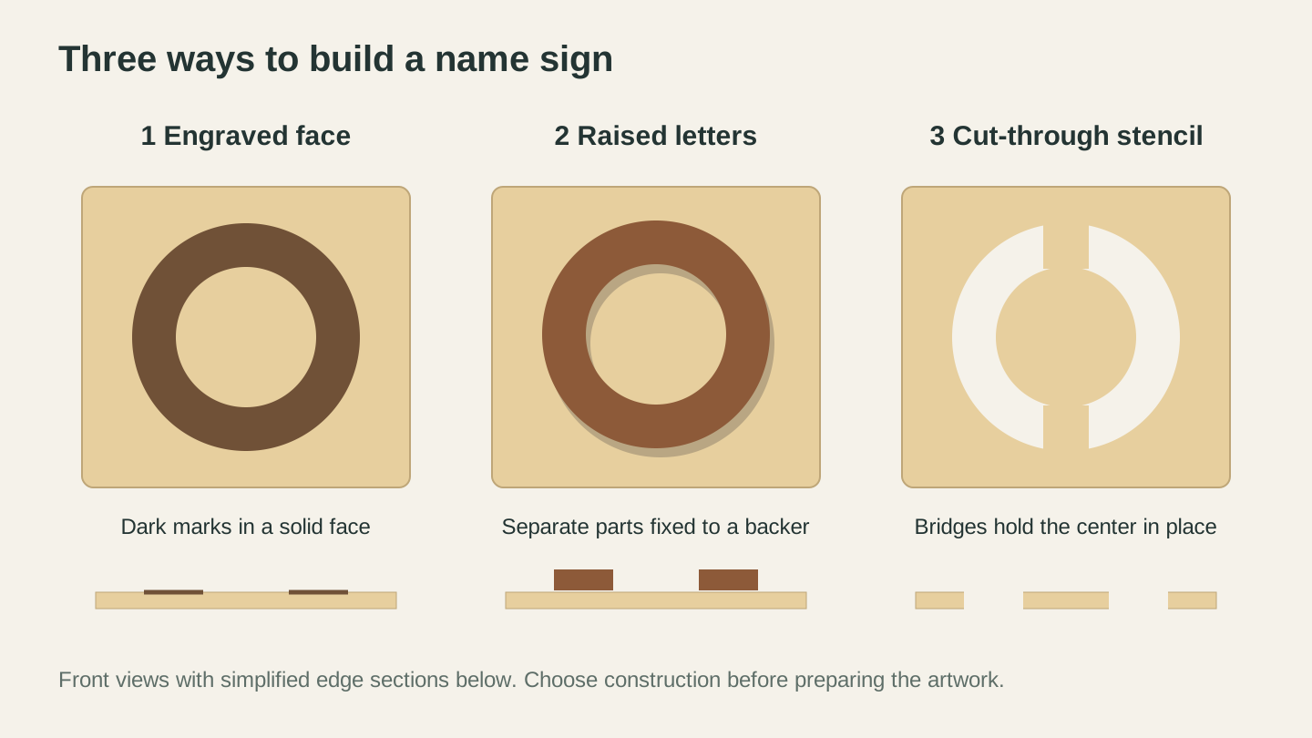
Decide how the lettering will be made before preparing the file. Engraving keeps the face intact; raised letters need a backer; a cut-through stencil needs bridges around enclosed centers.
The Build, Step by Step
1. Get a design you'd actually hang up
You do not need to be a designer, because the two most-requested sign layouts already have dedicated generators.
For the classic family sign, a botanical wreath with the name in the center, use the Family Wreath Generator (1 credit). Type a prefix like "The", the family name, and an optional suffix like "Est. 2024", and it produces the whole composition as a laser-ready SVG: wreath, typography, spacing, all balanced for you.
For a monogram-style sign, initials or a split-letter name with a decorative frame, the Monogram Generator is free and handles the typographic rules that make monograms fiddly: letter ordering, the split line, frame proportions. Pick split or classic, choose a font category, download the SVG.
Want something custom instead, say a mountain outline behind the name or a paw print for a pet sign? Describe it to Vector Studio (1 credit) and it generates a machine-ready SVG you can pair with your text.
2. Choose the font like it's the whole sign, because it is
A name sign is 90 percent typography. Three rules cover most of it:
- Match the font to the mood. Serif reads established and traditional. Script reads warm and personal. Clean sans-serif reads modern farmhouse. A horror-movie display font reads like a joke, which is fine only if it is one.
- Match the font to the construction. Engraving handles almost anything. Cut-out and cut-through lettering need sturdy strokes, so bold serifs and chunky scripts survive where delicate calligraphy shatters.
- Two fonts maximum. A script name with a small sans-serif "Est. 2019" underneath is a classic pairing. Three fonts on one sign always looks like a ransom note.
3. Pick the wood
For engraved signs you want a light, even-grained surface, because the design is literally drawn in scorch marks and the wood is your paper. Maple and birch plywood give crisp dark-on-light contrast; heavily grained or knotty boards fight the design. Resin content changes how dark the burn comes out and how easily it chars, which is one more reason the scrap test in step 5 is not optional. Our best wood for laser engraving guide ranks the common options and explains why some woods engrave muddy no matter what you do.
For cut-out lettering, 3mm birch plywood is the workhorse for the letters, glued to whatever handsome board you like as the backer, since the backer only gets cut or not touched at all.
4. Size it for the room, not the screen
The most common first-sign mistake is making it too small. For a front door sign meant to be read from the walkway, a name around 8 to 10 cm tall is a reasonable starting point; an entryway sign can go smaller. Readable size really depends on font, contrast, and distance, so validate it: print the design on paper at full size, tape it where the sign will live, and walk away from it. Thirty seconds of squinting from the hallway beats re-making the whole sign.
While you're at it, check margins. Text running to within a few millimeters of the board edge looks cramped. Leave breathing room, at least a letter-height of empty wood around the design.
5. Test on scrap from the same board
Never run the real board first. Engrave a small piece of the design, or a simple filled square, on an offcut of the same material, and adjust until the burn is dark and even without charring. Wood engraving settings shift with species, plywood brand, and even the moisture content of the board, so numbers from the internet are starting points at best. Our laser engraving settings for wood guide walks through how to dial in power and speed methodically instead of guessing.
Warning
Scorch haze around the engraving is the classic name-sign spoiler. Masking tape (transfer tape) over the wood before engraving catches the smoke residue, and you peel it off along with the mess. Cheap insurance on a sign someone will stare at daily.
6. Run the job
Engraved sign: engrave first, then cut the outline if your sign shape isn't just the board itself. Engraving before cutting means the piece can't shift out of a cut-free position halfway through.
Cut-out lettering: cut the letters, then dry-fit everything on the backer before any glue appears. Lay the letters out with a ruler against a light pencil baseline, check the spacing from arm's length, then glue one letter at a time. Wood glue gives you repositioning time; CA glue does not forgive.
7. Finish it
Raw laser-cut edges are dark and slightly sticky with resin. A light hand-sand with fine grit cleans faces without dulling the engraving. Then seal it: for indoor signs, a clear matte spray or wipe-on oil deepens the contrast and adds moisture resistance. An outdoor door sign needs an exterior-rated clear coat, and even then, check it each year and recoat when the finish starts to wear.
Add the hanger before you photograph it. Sawtooth hangers, drilled twine holes, or keyhole slots all work; just decide before finishing so any drilling happens on a piece you can still touch up.
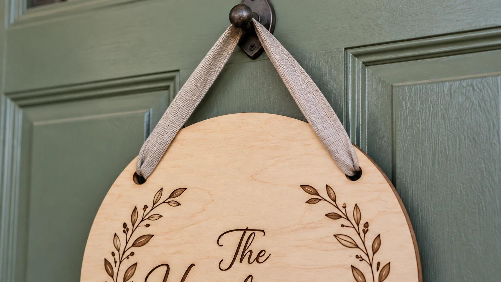
Leave solid wood around both hanging holes. The ribbon carries the sign’s weight through the holes, with the engraved decoration clear of the attachment points.
Common Ways Name Signs Go Wrong
- The clipart wreath with mismatched text. Grabbing a random wreath graphic and typing a name over it in a random font is why so many signs look homemade in the bad way. The wreath generator exists precisely because the composition is the hard part.
- Script fonts with broken connections. If a script font's letters don't visually connect, the name reads as disjointed shapes. Test the actual name, since some fonts connect "Miller" beautifully and butcher "Kowalski".
- Ignoring the counters on cut-through signs. The middle of every "o" hits the floor. Stencil fonts or manual bridges, decided at design time, not after.
- Engraving over ugly grain. A knot in the middle of the name ruins the sign. Position the design on the board before you commit, and buy one more board than you need.
Got a CNC Instead?
Everything above about layout, fonts, and sizing applies, but the machine work is a different world: V-bits, toolpaths, and carved depth instead of scorch. We wrote the CNC version separately in How to Make a Custom CNC Sign From Scratch.
Make the First One This Weekend
A name sign is the perfect first "real" laser project: one board, one design, a finished object someone will love. Start with the design, since that's the part that stalls people. Generate a wreath layout with the Family Wreath Generator, or build a free monogram with the Monogram Generator, send the SVG to your laser, and follow the seven steps above.
Fair warning: the moment it goes up on the door, the orders start.
Related Tools
Ready to try these tools?
Sign up free, no credit card required. Free tools available immediately.
Start Free