

How to Make a Custom CNC Sign From Scratch
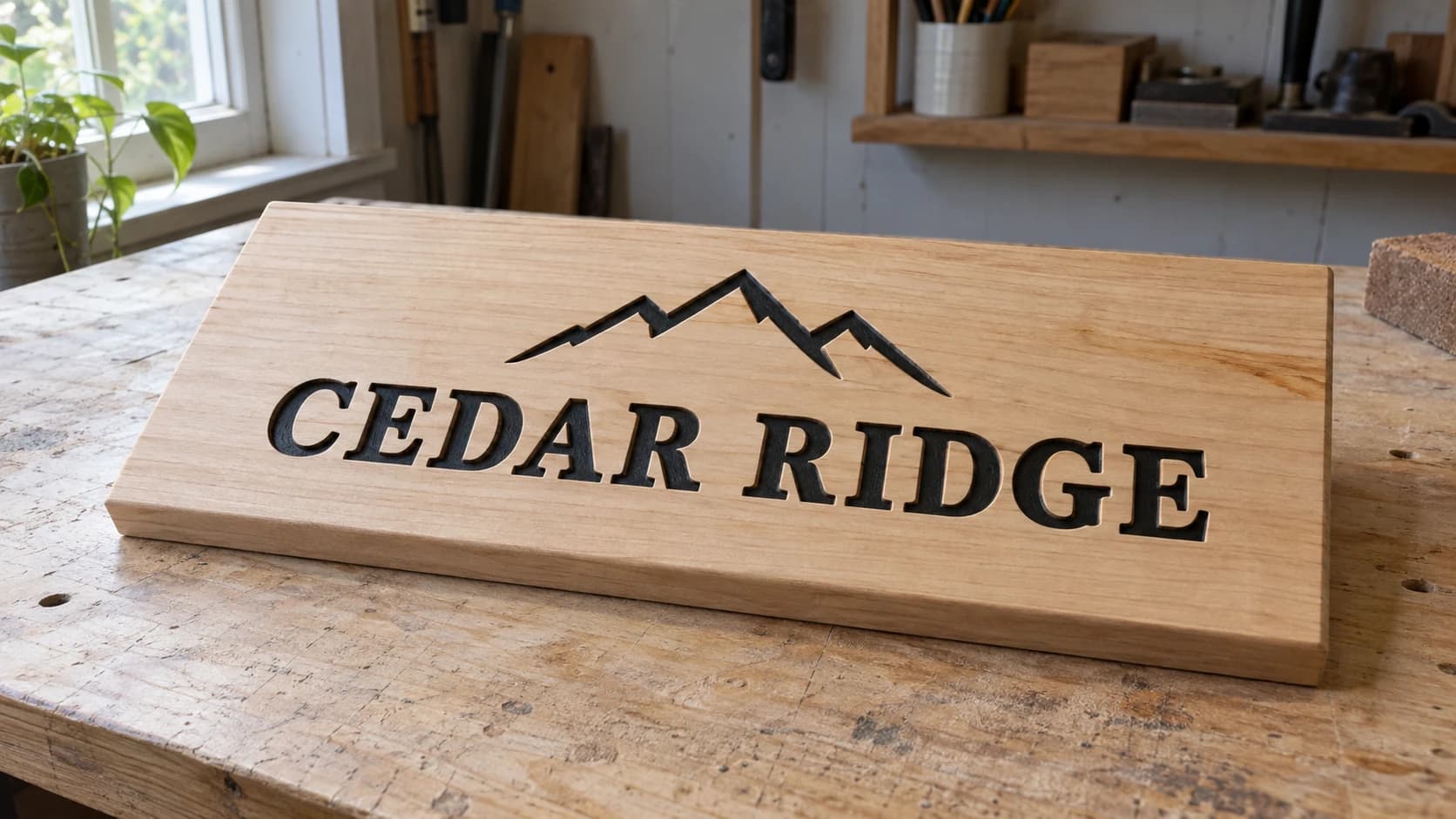
You have a name in your head. Maybe it's a family name for over the door, maybe it's a business name for a booth table, maybe it's just "The Coffee Is Ready" for the kitchen wall. You have a board on the bench. And in between those two things is a gap nobody explains, because every tutorial starts at "open your design file" and you don't have a design file.
That gap is the whole project. Carving is the easy part. Getting from an idea to a file your machine will actually accept is where people stall out for weeks.
So let's close it. This walkthrough goes idea, layout, artwork, file, toolpath, cut, finish. If you've never run a job before, read the CNC routing beginner's guide first, because this post assumes you can zero your machine and press go without panicking.
Step 1: Decide What the Sign Actually Is
Before you touch a computer, answer three questions. Skipping this is why so many first signs end up with text you can't read from the couch.
Where does it hang, and how far away is the viewer? A sign over a kitchen door gets read from six feet. A sign at the end of a driveway gets read from forty. The old signage rule of thumb is roughly one inch of capital letter height for every ten feet of viewing distance, and it holds up well for carved wood. It is a starting point, not a law, but it will keep you from carving quarter-inch letters onto a porch sign.
| Viewing distance | Rough minimum cap height | Typical sign |
|---|---|---|
| 3 to 6 feet | 3/4" to 1" | Kitchen, nursery, gift plaque |
| 10 to 15 feet | 1" to 1.5" | Entryway, above a doorway |
| 20 to 30 feet | 2" to 3" | Porch, garage, market booth |
| 40 feet and up | 4"+ | Driveway, barn, roadside |
How big is the board, really? Your work area is not your sign size. Subtract clamp room, subtract the bit diameter, subtract a margin so the design isn't crowding the edge. A 12x24 machine does not make a 12x24 sign.
Indoor or outdoor? This decides everything downstream: species, finish, and how forgiving you can be about thin details. Outdoor signs move with humidity, and delicate serifs are the first thing to chip.
Write the answers down. Overall size, text height, indoor or outdoor. Those three numbers drive every decision from here.
PRINT. CUT. CARVE.
- Multiple formats (SVG, DXF, PNG)
- Machine-tested designs
- Commercial licenses
Sponsored by PrintCutCarve.com
Step 2: Turn the Idea Into Artwork
Now you need the visual. There are three honest paths, and they're all fine.
Path A: Text only. Type your text in your CAM software, pick a font, set the height, done. This is the fastest route and it makes genuinely beautiful signs. Bold serif and slab fonts V-carve wonderfully. Very thin script and hairline sans fonts do not, because there isn't enough width for the bit to develop any depth, so the letters come out looking scratched rather than carved.
Path B: You have a logo or an image already. You need it as clean vector outlines, not a photo. If what you have is a PNG or a JPG, run it through MonoTrace to get an SVG. It's free and it handles logos, silhouettes, and high-contrast line art well.
Path C: You need artwork that doesn't exist yet. This is the one that stalls people. You want a mountain range behind the family name, or a pair of crossed oars, or a laurel wreath, and drawing has never been your thing.
Describe it instead. Vector Studio takes a text description and gives you back a machine-ready SVG. Ask for "a simple mountain range silhouette with three peaks, bold shapes, no fine detail" and you get clean closed outlines instead of a sketch you have to trace by hand. It costs 1 credit per generation and requires a signed-in account. There's a fuller walkthrough in our AI SVG generator guide.
Tip
When you're describing artwork for a sign, ask for bold shapes that stay closed and simple. Say "silhouette" and "solid shapes." Every hairline detail you request is a detail your bit will either skip or turn into a chipped mess. Signs read from a distance. Detail you can't see from across the room is just carve time.
Whatever path you take, the output needs to be vectors. A vector is a shape defined by curves and lines. A photo is a grid of pixels. Your machine can only follow a path, so the artwork must eventually be paths.
Step 3: Get the File Into a Format Your CAM Software Accepts
This is where people hit a wall that has nothing to do with woodworking. You have an SVG, your software wants a DXF. Or your software imports SVG but scales it wrong.
| Format | What it is | Where it shows up |
|---|---|---|
| SVG | Vector, web-native, carries units and curves | Most modern CAM software imports it directly |
| DXF | Vector, CAD-native, the old reliable | Required by a lot of CAM and controller software |
| Vector or raster depending on how it was made | Common when someone sends you "the logo" | |
| PNG / JPG | Pixels, not paths | Must be traced to vector before toolpathing |
If your software wants a DXF and you have an SVG, File Converter handles SVG to DXF without using tool credits. It also does PDF to SVG for that logo a customer emailed you. Our SVG to DXF guide covers the conversion in detail. Downloading the converted file requires an active paid plan.
Two things to check the moment the file lands in your CAM software:
-
Scale. Draw a known reference in your artwork, like a 1 inch square, or just measure the imported width against what you expected. Import scaling is a common reason a first sign comes out dramatically smaller or larger than intended.
-
Closed paths. Every letter and shape should be a closed loop. Pocketing needs a closed boundary to fill, so an open path will usually only give you a line to follow. Most CAM software has a "join open vectors" command with a tolerance setting. Run it before you toolpath.
Warning
Check your design for overlapping vectors before you cut. If two shapes overlap, a V-carve toolpath will try to carve both boundaries and you'll get a strange raised ridge where they cross. Weld or union overlapping shapes first, especially in script fonts where the letters intentionally touch.
Step 4: Pick the Board
Sign wood is not project wood. You want a board that carves cleanly and stays flat next winter.
- Poplar is the beginner favorite. Cheap, carves cleanly, takes paint beautifully. Its green and purple streaks vanish under paint. Not for outdoors without real protection.
- Basswood and pine carve like butter and are very forgiving. Pine's soft early wood and hard late wood can fuzz, so a sharp bit matters.
- Maple and walnut give you the expensive look. Harder on bits, harder on your feed rate, gorgeous when finished.
- Cedar and redwood are the outdoor choices. The natural decay resistance is in the heartwood and varies a lot by species and by tree, so it is not a guarantee. Both are soft enough that fine detail can crumble.
- MDF carves with almost no tearout and paints perfectly, and it turns to mush the moment it gets damp. Indoor only, and always with dust collection because the dust is genuinely nasty.
Our best wood for CNC routing guide goes species by species if you want the long version.
Flatness matters more than species. A cupped board means your carve depth varies across the sign, so the letters on one end come out shallow and the letters on the other end come out too deep. If your board rocks on the bench, surface it or pick another one.
Step 5: Build the Toolpaths
A sign is usually two or three operations, in this order.
1. The V-carve. This is the one that makes it look like a sign. A V-bit cuts deeper where the shape is wide and shallower where it's narrow, which produces those crisp pointed letter corners no straight bit can make. A 90 degree bit is the friendlier starting point, since it cuts shallower for the same geometry and tends to suit larger text. A 60 degree bit gets finer detail at the cost of depth.
2. A pocket or clearing pass, if you want a raised look. Instead of carving the letters into the surface, you clear the background away and leave the letters standing proud. This uses a flat end mill to remove everything outside the text, usually to a shallow depth like 1/8". It takes much longer to run and looks fantastic.
3. The profile cut, if the sign shape isn't just the rectangle you started with. Rounded corners, an arched top, a plaque outline. Cut this last, and add tabs so the sign doesn't come loose and get flung across the shop on the final pass.
Info
Order matters. Carve the detail first while the stock is still fully supported by the surrounding material, then cut the outline last. If you profile first, the piece is only held by tabs while your V-bit is trying to do fine work, and everything vibrates.
About feeds, speeds, and depth of cut
Here is the honest version: nobody on the internet can give you numbers for your machine. Rigidity, spindle, bit quality, and stock all change the answer, and a number that works beautifully on a heavy machine can snap a bit on a lightweight one.
Treat every number you find, including from your CAM software's default library, as a starting point to verify. Check the bit manufacturer's recommended chip load, check your machine maker's published guidance for your material, then prove it on scrap of the same species and thickness before you touch the good board. If the machine screams, chatters, or the finish looks torn, stop and reduce depth per pass first, then feed rate. Our feeds and speeds guide explains the relationships so the numbers you find actually mean something to you.
Run an air pass or a scrap test on every new sign design. It costs ten minutes and saves boards.
Step 6: Hold It Down and Set Zero
Workholding for signs is easy because signs are flat and you're not taking heavy cuts. The usual methods:
- Painter's tape and CA glue. Tape on the spoilboard, tape on the bottom of the sign, thin CA glue between the two tape layers. Strong, leaves no marks, releases with a putty knife.
- Clamps at the corners. Fast and reliable, as long as your toolpath never goes anywhere near them. Check your travel limits in the preview.
- Screws through waste areas. If your sign gets a profile cut, you can screw through the outer waste that gets cut away anyway.
Set X and Y zero wherever your CAM setup says, usually the bottom left corner or the center. Set Z zero to the top surface of the board, not the spoilboard, unless your toolpaths were built the other way. Getting this backwards is how you carve a sign the full thickness of your board too deep.
Then look at the toolpath preview one more time. Yes, again. Everyone who has ever carved a name upside down had also "already checked."
Step 7: Cut It
Safety glasses on, hearing protection on, dust collection running, sleeves out of the way. Stand where you can reach the emergency stop without lunging for it.
Watch the first minute. That's when you find out whether your Z zero was right, whether the board is actually held down, and whether the bit is happy. Listen for chatter. A cutting machine has a sound, and once you've heard the good one, the bad one is unmistakable.
When the V-carve finishes, resist the urge to unclamp and look. If you have a second operation, leaving the stock in place preserves your zero. Change the bit, re-zero Z for the new bit only, and run the next path.
Step 8: Finish It So It Looks Bought
The finishing step is what separates "I made this" from "where did you buy that."
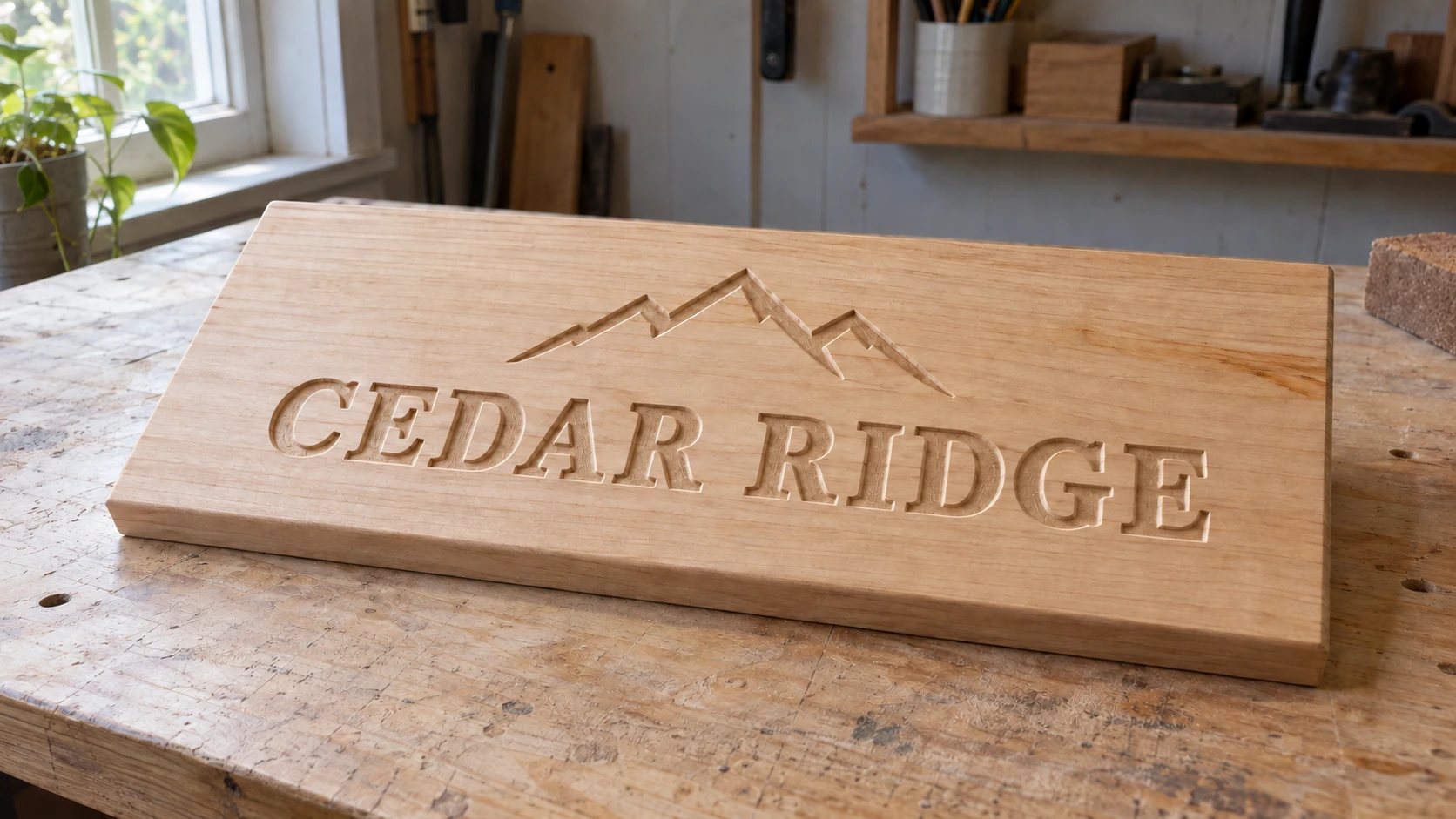
Before paint, the recesses are easiest to see in the side light. The finished example uses this same sign and layout.
Sand first, gently. 180 to 220 grit on the flat surfaces. Do not sand into the carved letters. A folded piece of sandpaper and a light touch on the faces only.
Paint the letters using the sand-back trick. Push paint into the carved recesses with a foam brush, going slightly over the edges on purpose. Let it dry all the way. Then sand the flat face with 220 grit. The paint stays down in the carve and comes off the surface, so you get a clean two-tone sign with no cutting in required.
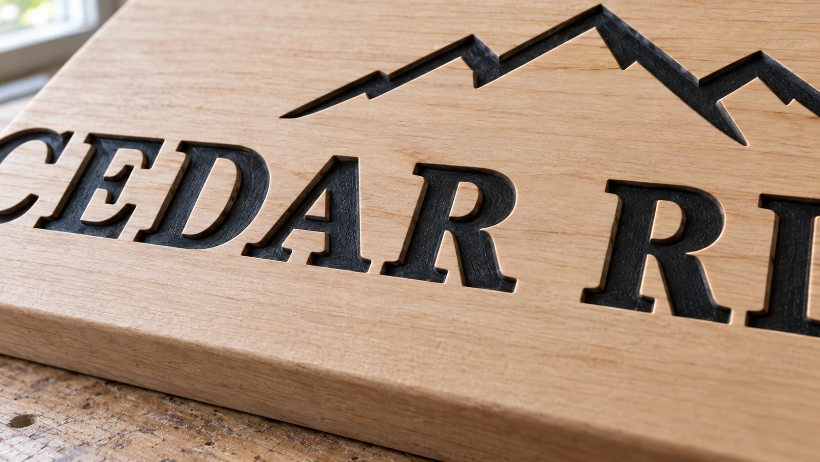
The paint stays below the original surface. Sanding the flat face clears the edges without rounding over the letters.
Seal it. Oil finishes bring out grain and are very forgiving. Wipe-on polyurethane gives more protection. Outdoor signs need an exterior-rated finish and a re-coat schedule, and they need the back and edges sealed too, not just the pretty face. Our finishing guide covers the options in depth.
Tip
For a fast, high-contrast look on painted signs, prime and paint the whole board before carving. Carve through the paint layer and the fresh wood underneath becomes the letters. No masking, no sanding back, and the edges are razor crisp.
When It Goes Wrong
The letters look scratched, not carved. Your font is too thin for the letter height, or your V-carve depth is capped too shallow. Go bolder or bigger.
Depth varies across the sign. The board isn't flat or your spoilboard isn't surfaced. Surface the spoilboard, then re-check.
Fuzzy edges on the letters. Dull bit, or a species that fuzzes like pine and plywood. A fresh bit fixes most of it, and a light sanding with 220 fixes the rest.
Fine details vanished. The bit physically couldn't reach into them. Every V-bit has a minimum feature width based on its tip. Simplify the artwork rather than fighting the geometry.
The whole design came out tiny or huge. Import scale. Go back to Step 3 and measure a known dimension after import.
Make the Second One
Your first sign will have something wrong with it. A letter slightly too close to the edge, a finish that went blotchy, a font choice you'll regret. Hang it anyway. It's the first one.
Then make the second one, and notice how much faster the whole thing goes now that you know the sequence. By the fourth sign you'll be designing while the third one is still drying, and somebody at a family gathering is going to ask if you take orders.
Start with the artwork. Describe what you want in Vector Studio, convert it with File Converter if your software needs a DXF, and go cut something with your name on it.
Related Tools
Ready to try these tools?
Sign up free, no credit card required. Free tools available immediately.
Start Free